5. 정적 시각화
데이터 시각화
직관적으로 정보를 확인하는 효과적인 방법 => 적절한 그래프 유형 선택과 옵션 활용이 중요
그래프 구성 요소
그래프를 구성하는 요소와 방식을 안다면 다양한 활용 가능
- figure : 도화지(그림 전체)
- axes : 도화지 내 plot이 그려지는 공간
- axis : plot의 축 -> y축, x축
파이썬 시각화 라이브러리
대표적으로 Matplotlib과 Seaborn을 많이 사용함
| Matplotlib | | Seaborn |
|---|
| 파이썬의 기본적인 시각화 라이브러리 | 기능 | 통계 시각화에 특화 |
| 기본적이고 단순한 디스플레이 | 디스플레이 | 다채로운 시각화 가능 |
| 한 줄의 코드로 복잡한 그래프 구현이 어려움 | 복잡도 | 쉽고 간단하게 복잡한 기능 구현 |
| 여러 개의 시각화 가능 | 다중성 | 다중 시각화 어려움(메모리 부족 이슈) |
유연한 인터페이스 제공
(즉, 원하는 기능 구현 용이) | 유연성 | 유연성이 상대적으로 떨어짐 |
정적 시각화
Matplotlib
파이썬의 가장 인기 있는 데이터 시각화 라이브러리로, 2D 형태의 그래프와 이미지를 그릴 때 많이 사용
=> pyplot 모듈을 많이 사용, 주로 plt라는 별칭 이용하여 호출
import matplotlib.pyplot as plt
Matplotlib의 특징
유연한 인터페이스
Matplotlib 그래프 그리기
plt.figure() : 새로운 그래프를 담을 도화지(figure) 생성plt.plot() : 데이터 시각화 기능 담당, 그래프 유형(plot, hist, pie 등) 과 변수를 주어 설정 가능plt.show() : 그래프 출력Matplotlib 그래프 구성 요소
pyplot을 이용하면 figure, axes, axis를 쉽게 조작 가능
여러 개의 그래프 그리기
여러 개의 그래프를 하나의 figure에 담는다면 한번에 더 많은 정보를 효과적으로 전달할 수 있음
=> subplot과 subplots 커맨드를 활용하여 여러 그래프 구현 가능
subplot
plt.subplot(row, column, index)
subplots
axes 객체의 twinx 메소드를 이용하면 x축을 공유하는 두 개의 그래프를 동시에 그릴 수 있음
Seaborn
Maptplotlib을 기반으로 하며 다채로운 디자인 테마와 통계용 차트 등이 추가된 강력한 시각화 라이브러리
=> 한 줄의 코드로 강력한 시각화 가능
import seaborn as sns
Seaborn 특징
- 간결한 한 줄 코드로 수비고 간단하게 복잡한 기능 구현
- 하지만, 변수가 추가될수록 메모리 부족 이슈 & 가독성 떨어짐
- 통계 시각화에 특화
- 간단한 명령어로 범주별 산점도 구현
statsmodels의 통계 기능 활용으로 추세선 출력- 이외에도
jointplot을 포함한 여러 플롯 메소드에서 statsmodels를 이용한 데이터 분포 시각화를 함
- 데이터에 적합한 다채로운 시각화 기능을 제공
Seaborn 그래프 그리기
1
2
| import seaborn as sns
sns.scatterplot(x='변수명', y='변수명', hue='범주형 변수명', data=데이터이름)
|
실습
Matplotlib
1
2
3
4
5
| import matplotlib.pyplot as plt
import numpy as np
# 브라우저 내부(inline)에 바로 그려지도록 해주는 코드
%matplotlib inline
|
1
2
3
4
5
| np.random.seed(0)
x = np.arange(50)
y = np.random.randn(50)
print(y)
|
1
2
3
4
5
6
7
8
9
| [ 1.76405235 0.40015721 0.97873798 2.2408932 1.86755799 -0.97727788
0.95008842 -0.15135721 -0.10321885 0.4105985 0.14404357 1.45427351
0.76103773 0.12167502 0.44386323 0.33367433 1.49407907 -0.20515826
0.3130677 -0.85409574 -2.55298982 0.6536186 0.8644362 -0.74216502
2.26975462 -1.45436567 0.04575852 -0.18718385 1.53277921 1.46935877
0.15494743 0.37816252 -0.88778575 -1.98079647 -0.34791215 0.15634897
1.23029068 1.20237985 -0.38732682 -0.30230275 -1.04855297 -1.42001794
-1.70627019 1.9507754 -0.50965218 -0.4380743 -1.25279536 0.77749036
-1.61389785 -0.21274028]
|
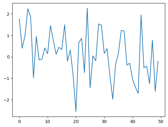
기본 그래프 그리기
- figure를 만들고 -> plt.figure()
- figure내 그래프를 그리고 -> plt.plot(x, y)
- 그래프를 출력 -> plt.show()
1
2
3
| plt.figure()
plt.plot(x, y)
plt.show()
|
1
2
3
4
5
6
7
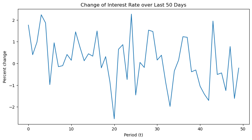
| plt.figure(figsize=(10, 5))
plt.plot(x, y)
plt.xlabel('Period (t)')
plt.ylabel('Percent change')
plt.title('Change of Interest Rate over Last 50 Days')
# plt.savefig('./data/interest_rate.png)
plt.show()
|
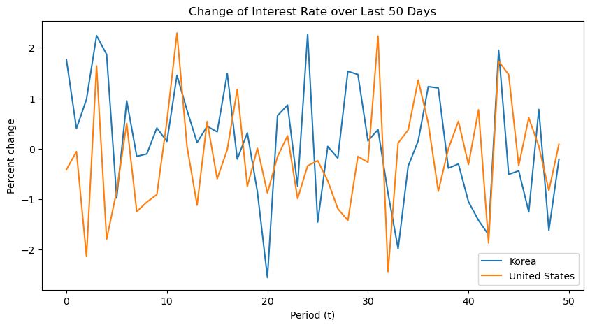
그래프에 데이터 추가
1
2
3
4
5
| np.random.seed(2)
z = np.random.randn(50)
print(z)
|
1
2
3
4
5
6
7
8
9
10
11
12
13
| [-4.16757847e-01 -5.62668272e-02 -2.13619610e+00 1.64027081e+00
-1.79343559e+00 -8.41747366e-01 5.02881417e-01 -1.24528809e+00
-1.05795222e+00 -9.09007615e-01 5.51454045e-01 2.29220801e+00
4.15393930e-02 -1.11792545e+00 5.39058321e-01 -5.96159700e-01
-1.91304965e-02 1.17500122e+00 -7.47870949e-01 9.02525097e-03
-8.78107893e-01 -1.56434170e-01 2.56570452e-01 -9.88779049e-01
-3.38821966e-01 -2.36184031e-01 -6.37655012e-01 -1.18761229e+00
-1.42121723e+00 -1.53495196e-01 -2.69056960e-01 2.23136679e+00
-2.43476758e+00 1.12726505e-01 3.70444537e-01 1.35963386e+00
5.01857207e-01 -8.44213704e-01 9.76147160e-06 5.42352572e-01
-3.13508197e-01 7.71011738e-01 -1.86809065e+00 1.73118467e+00
1.46767801e+00 -3.35677339e-01 6.11340780e-01 4.79705919e-02
-8.29135289e-01 8.77102184e-02]
|
1
2
3
4
5
6
7
8
9
| plt.figure(figsize=(10, 5))
plt.plot(x, y, label='Korea')
plt.plot(x, z, label='United States')
plt.xlabel('Period (t)')
plt.ylabel('Percent change')
plt.title('Change of Interest Rate over Last 50 Days')
plt.legend()
# plt.savefig('./data/interest_rate.png)
plt.show()
|
그래프 여러개 그리기
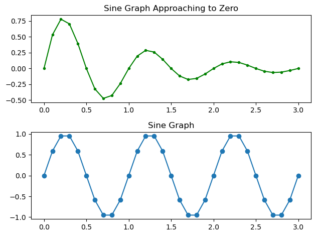
1. subplot
plt.subplot(행, 열, 인덱스)
1
2
| a = np.linspace(0.0, 3.0, 31)
print(a)
|
1
2
| [0. 0.1 0.2 0.3 0.4 0.5 0.6 0.7 0.8 0.9 1. 1.1 1.2 1.3 1.4 1.5 1.6 1.7
1.8 1.9 2. 2.1 2.2 2.3 2.4 2.5 2.6 2.7 2.8 2.9 3. ]
|
1
2
3
4
5
| sin = np.sin(2 * np.pi * a)
print(sin)
decaying_sin = np.sin(2 * np.pi * a) * np.exp(-a)
print(decaying_sin)
|
1
2
3
4
5
6
7
8
9
10
11
12
13
14
15
16
| [ 0.00000000e+00 5.87785252e-01 9.51056516e-01 9.51056516e-01
5.87785252e-01 1.22464680e-16 -5.87785252e-01 -9.51056516e-01
-9.51056516e-01 -5.87785252e-01 -2.44929360e-16 5.87785252e-01
9.51056516e-01 9.51056516e-01 5.87785252e-01 3.67394040e-16
-5.87785252e-01 -9.51056516e-01 -9.51056516e-01 -5.87785252e-01
-4.89858720e-16 5.87785252e-01 9.51056516e-01 9.51056516e-01
5.87785252e-01 6.12323400e-16 -5.87785252e-01 -9.51056516e-01
-9.51056516e-01 -5.87785252e-01 -7.34788079e-16]
[ 0.00000000e+00 5.31850090e-01 7.78659218e-01 7.04559996e-01
3.94004237e-01 7.42785831e-17 -3.22583386e-01 -4.72280689e-01
-4.27337239e-01 -2.38975650e-01 -9.01044760e-17 1.95656714e-01
2.86452718e-01 2.59193138e-01 1.44946059e-01 8.19766909e-17
-1.18671796e-01 -1.73742356e-01 -1.57208585e-01 -8.79142286e-02
-6.62951686e-17 7.19780826e-02 1.05380066e-01 9.53518266e-02
5.33226751e-02 5.02625654e-17 -4.36569139e-02 -6.39162408e-02
-5.78338063e-02 -3.23418373e-02 -3.65829443e-17]
|
1
2
3
4
5
6
7
8
9
10
| plt.subplot(2, 1, 1)
plt.plot(a, decaying_sin, '-g.') # 라인 : -, 초록색 : g, 도트 : .
plt.title('Sine Graph Approaching to Zero')
plt.subplot(2, 1, 2)
plt.plot(a, sin, 'o-') # 도트 : o, 라인 : -
plt.title('Sine Graph')
plt.tight_layout()
plt.show()
|
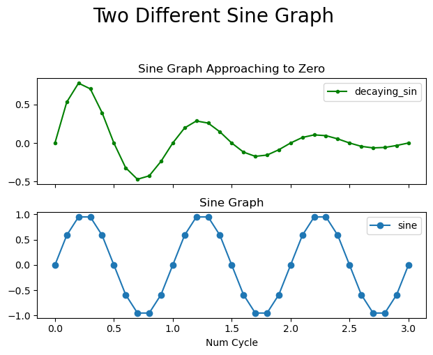
sharex : x축 공유
1
2
3
4
5
6
7
8
9
10
11
12
13
14
15
16
| plt.subplot(2, 1, 1)
plt.plot(a, decaying_sin, '-g.', label='decaying_sin') # 라인 : -, 초록색 : g, 도트 : .
plt.xticks(visible=False)
plt.title('Sine Graph Approaching to Zero')
plt.legend()
plt.subplot(2, 1, 2)
plt.plot(a, sin, 'o-', label='sine') # 도트 : o, 라인 : -
plt.title('Sine Graph')
plt.xlabel('Num Cycle')
plt.legend()
plt.suptitle('Two Different Sine Graph', y=1.05, fontsize=20)
plt.tight_layout()
plt.show()
|
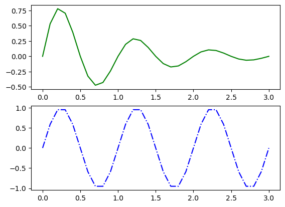
2. subplots
1
2
3
4
| fig, ax = plt.subplots(2, 1)
ax[0].plot(a, decaying_sin, 'g-')
ax[1].plot(a, sin, 'b-.')
plt.show()
|
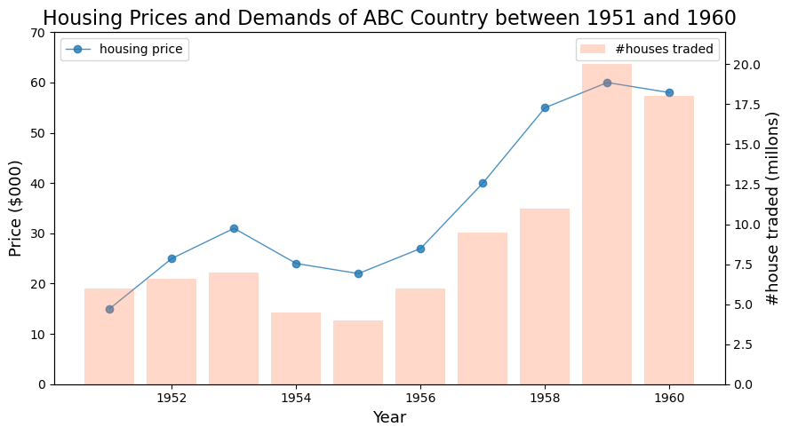
subplot과 subplots의 차이는 state-based와 object-oriented 방식의 차이두 종류의 그래프 하나에 담기 : 바 그래프 & 라인 그래프
1
2
3
4
| # 토이 데이터
periods = np.arange(1951, 1961)
housing_prices = np.array([15, 25, 31, 24, 22, 27, 40, 55, 60, 58])
num_trading = np.array([6, 6.6, 7, 4.5, 4, 6, 9.5, 11, 20, 18])
|
1
2
3
4
5
6
7
8
9
10
11
12
13
14
15
16
17
18
19
20
| fig, ax1 = plt.subplots(figsize=(9, 5))
#ax1
ax1.plot(periods, housing_prices, 'o-', linewidth=1, alpha=0.8, label='housing price')
ax1.set_xlabel('Year', fontsize=13)
ax1.set_ylabel('Price ($000)', fontsize=13)
ax1.set_ylim(0, 70) # ax1의 y축 범위 설정
ax2 = ax1.twinx() # twinx는 x축은 공유하지만 y축은 공유하지 않음
ax2.bar(periods, num_trading, color='coral', alpha=0.3, label='#houses traded')
ax2.set_ylabel('#house traded (millons)', fontsize=13)
ax2.set_ylim(0, 22)
ax1.legend(loc='upper left')
ax2.legend(loc='upper right')
plt.title('Housing Prices and Demands of ABC Country between 1951 and 1960', fontsize=16)
plt.tight_layout()
plt.show()
|
Seaborn
1
2
3
| import pandas as pd
import matplotlib.pyplot as plt
import seaborn as sns
|
1
| sns.get_dataset_names()
|
1
2
3
4
5
6
7
8
9
10
11
12
13
14
15
16
17
18
19
20
21
22
| ['anagrams',
'anscombe',
'attention',
'brain_networks',
'car_crashes',
'diamonds',
'dots',
'dowjones',
'exercise',
'flights',
'fmri',
'geyser',
'glue',
'healthexp',
'iris',
'mpg',
'penguins',
'planets',
'seaice',
'taxis',
'tips',
'titanic']
|
1
2
| df = sns.load_dataset('iris')
display(df.head())
|
| sepal_length | sepal_width | petal_length | petal_width | species |
|---|
| 0 | 5.1 | 3.5 | 1.4 | 0.2 | setosa |
|---|
| 1 | 4.9 | 3.0 | 1.4 | 0.2 | setosa |
|---|
| 2 | 4.7 | 3.2 | 1.3 | 0.2 | setosa |
|---|
| 3 | 4.6 | 3.1 | 1.5 | 0.2 | setosa |
|---|
| 4 | 5.0 | 3.6 | 1.4 | 0.2 | setosa |
|---|
1
| array(['setosa', 'versicolor', 'virginica'], dtype=object)
|
1
| df['species'].value_counts()
|
1
2
3
4
| setosa 50
versicolor 50
virginica 50
Name: species, dtype: int64
|
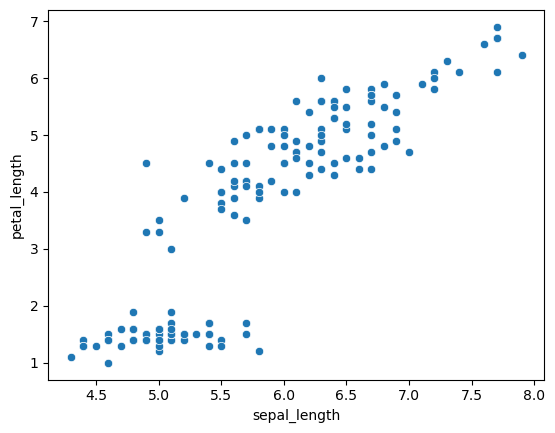
산점도 : scatterplot
1
2
| sns.scatterplot(x='sepal_length', y='petal_length', data=df)
plt.show()
|
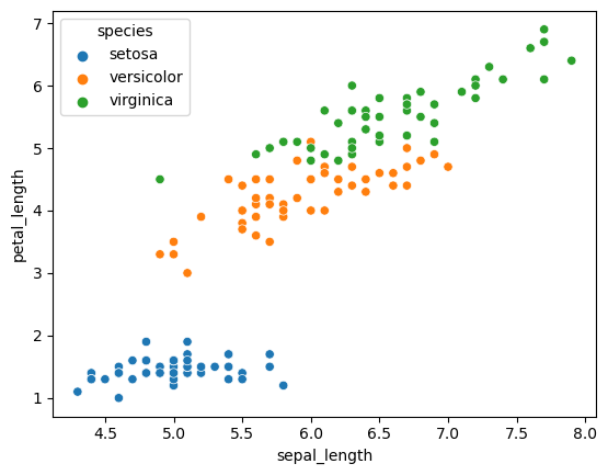
scatterplot의 hue 옵션
1
2
| sns.scatterplot(x='sepal_length', y='petal_length',hue='species', data=df)
plt.show()
|
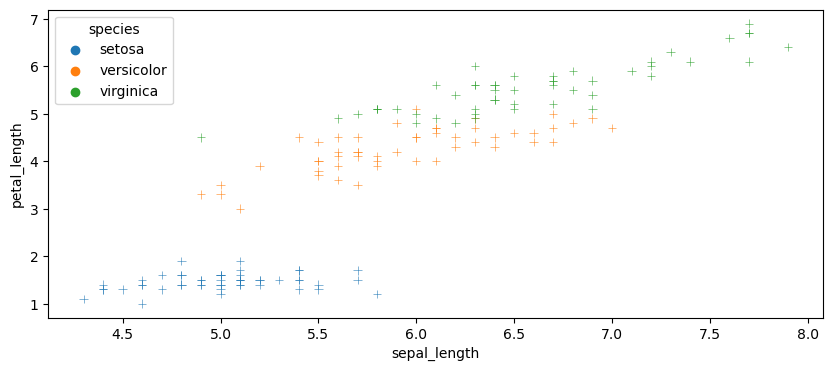
scatterplot의 marker & alpha 옵션
1
2
3
4
5
6
7
8
9
10
11
| plt.figure(figsize=(10, 4))
sns.scatterplot(
x='sepal_length',
y='petal_length',
hue='species',
marker='+',
alpha=0.8,
data=df
)
plt.show()
|
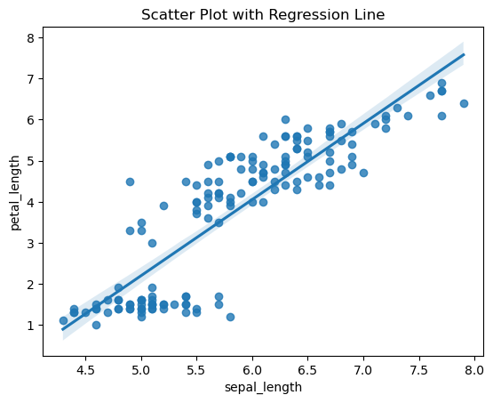
산점도 + 추세선 : regplot
1
2
3
| sns.regplot(x='sepal_length', y='petal_length', data=df)
plt.title('Scatter Plot with Regression Line')
plt.show()
|
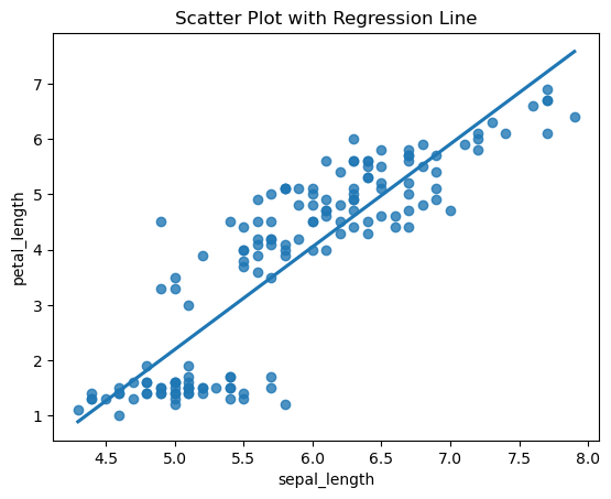
신뢰구간 제거 : ci 인수
1
2
3
| sns.regplot(x='sepal_length', y='petal_length', ci=None, data=df)
plt.title('Scatter Plot with Regression Line')
plt.show()
|
1
2
3
| sns.regplot(x='sepal_length', y='petal_length',hue='species', ci=None, data=df)
plt.title('Scatter Plot with Regression Line')
plt.show()
|
1
2
3
4
5
6
7
8
9
10
11
| ---------------------------------------------------------------------------
TypeError Traceback (most recent call last)
~\AppData\Local\Temp\ipykernel_18960\506309253.py in <module>
----> 1 sns.regplot(x='sepal_length', y='petal_length',hue='species', ci=None, data=df)
2 plt.title('Scatter Plot with Regression Line')
3 plt.show()
TypeError: regplot() got an unexpected keyword argument 'hue'
|
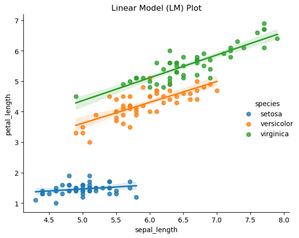
범주별 산점도 + 추세선 : lmplot
1
2
3
4
| sns.lmplot(x='sepal_length', y='petal_length',hue='species', data=df)
plt.title('Linear Model (LM) Plot')
plt.tight_layout()
plt.show()
|
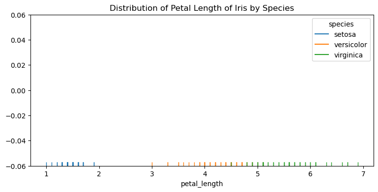
점도표 : rugplot
1
2
3
4
| plt.figure(figsize=(9, 4))
sns.rugplot(x='petal_length', hue='species', data=df)
plt.title('Distribution of Petal Length of Iris by Species')
plt.show()
|
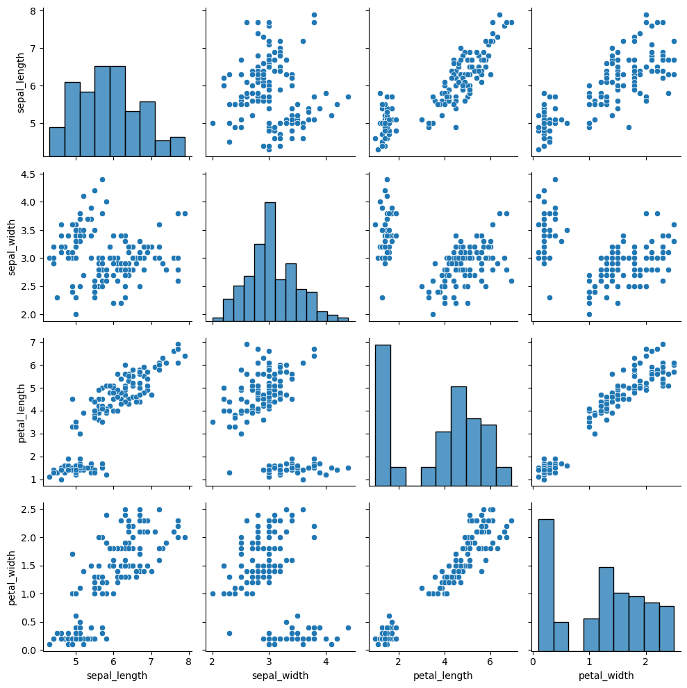
단변량 & 다변량 시각화 : pairplot
1
2
3
| sns.pairplot(df)
plt.tight_layout()
plt.show()
|
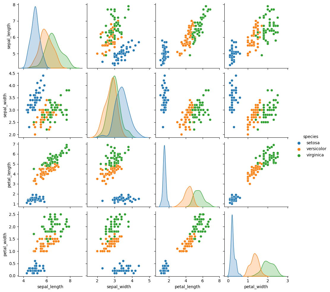
범주별 pairplot : hue 옵션
1
2
| sns.pairplot(df, hue='species')
plt.show()
|
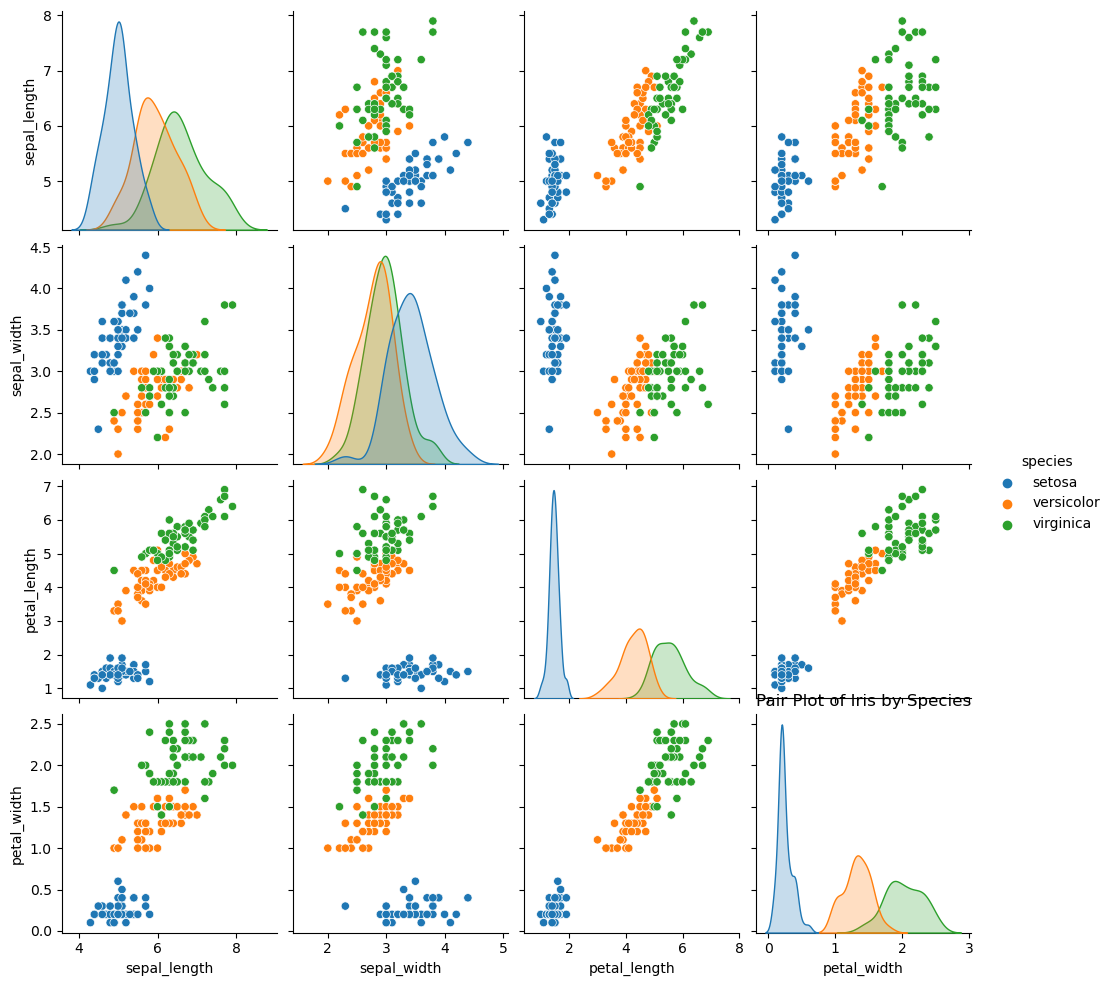
1
2
3
| sns.pairplot(df, hue='species')
plt.title('Pair Plot of Iris by Species') # 이상한 곳에 title이 생성 됨
plt.show()
|
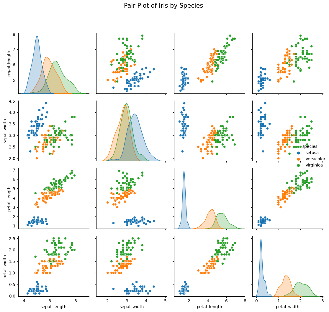
1
2
3
4
5
6
7
8
| # 정상적으로 title 생성 방법
# 1. pairplot을 plot 이라는 변수에 할당
plot = sns.pairplot(df, hue='species')
# 2. fig.suptitle 기능 활용
plot.fig.suptitle('Pair Plot of Iris by Species', y=1.05, fontsize=15)
plt.tight_layout()
plt.show()
|
pairplot은 강력한 기능이긴 하지만, 모든 상황에서 사용할 수 있는 것은 아님
실수형 변수가 더 많은 경우라면(e.g. 10개, 20개, 100개, …), figure에 모든 정보를 담기 힘들며, 연산 시간이 오래 걸릴 것.
결국 가독성이 떨어지는 그래프가 나오거나, 알아보기 불가능한 그래프, 또는 메모리 부족과 같은 문제가 생기게 됨
seaborn의 heatmap
example data 필요
1
2
| car_rentals = pd.read_csv('./data/car_rentals.csv')
display(car_rentals)
|
피봇 테이블 생성 : pivot_table
1
2
| rental_pivot = pd.pivot_table(car_rentals, index='month', columns='year', values='rentals')
display(rental_pivot)
|
1
2
3
4
| plt.figure(figsize=(8, 4))
sns.heatmap(rental_pivot)
plt.title('Heatmap of Number of Car Rentals', fontsize=15)
plt.show()
|
1
2
3
4
5
6
7
8
9
10
| plt.figure(figsize=(8, 4))
sns.heatmap(
rental_pivot,
cbar=True, # 그래프 우측 컬러바 표기 여부
linewidths=0.5 # cell 사이의 간격 설정
annot=False, # 히트맵 빈도수 표기
cmap='Blues' # 히트맵 색상 설정
)
plt.title('Heatmap of Number of Car Rentals', fontsize=18)
plt.show()
|